One Graph or Many: Taking an Equity Lens When Visualizing Data by Race
For many data communicators, presenting data disaggregated by race or ethnicity can pose a tricky problem. It’s not uncommon to place the data for each group in a single graph, but this presentation can lead the reader to compare the performance of each group to the best performing group, creating a “horse race effect.” As a result, a reader may negatively perceive the experiences of one group relative to another.
Another common approach entails splitting the data across several charts (often called small multiple charts, but also known as trellis or panel charts). This presentation might encourage readers to think about the specific needs and challenges facing each group but loses the relative ease of comparison that a single graph provides.
Deciding which approach to take — single graph or small multiples — often depends on the context surrounding the data. Here, I examine the questions that data communicators should consider when visualizing disaggregated race and ethnicity especially when viewing their work through a lens of equity and inclusivity.
Understanding the “horse race” effect
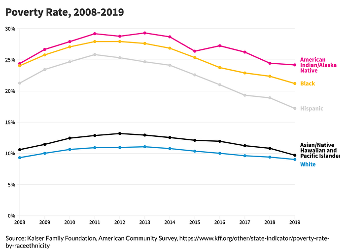
Although a single graph tends to be the preferred approach for many data communicators, putting each data point in concert with each can lead to a “horse race” effect. To demonstrate this phenomenon, let’s take a simple example graph showing US poverty rates over time by major race and ethnicity groups. The reader might view the group with the lowest poverty rates — in this case the white group (in blue) — as the goal or the target that the other groups should seek to reach. But this perception unfairly centers the white group as the ideal. In actuality, the target should be a poverty rate of 0 percent for all races and ethnicities.

Showing all groups together can lead to a “deficit-based perspective,” which can focus attention on what low-performing groups are lacking compared with the high-performing groups. In a recent paper, Dispersion vs Disparity: Hiding Variability Can Encourage Stereotyping When Visualizing Social Outcomes (and summary blog post), authors Eli Holder and Cindy Xiong find that “visualizing social outcome disparities can create a deficit framing effect and that some of the most popular chart choices (i.e., bar charts and line charts) can make the effect significantly worse.” In other words, instead of raising awareness, this type of data visualization can actually make people’s perceptions of the causes of inequality worse.
Further, simple data visualizations like this line chart don’t capture the complexity and nuance of people’s experiences or the myriad of factors that might affect the trends we see. Especially in standard graphs, like line and bar charts, we can lose sight of the variability and uncertainty in the underlying data, and, in this case, the nuances of racial equity.
Using other visualization types to show variability
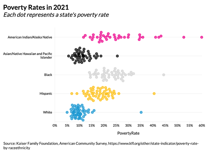
By showing more variability in the data rather than summarizing the data as aggregate shapes, we can begin to address the deficit-framing problem. Box-and-whisker charts, for example, enable us to show specific percentile points in the data rather than just a single measure. The box-and-whisker chart below shows the distribution of poverty rates across the 50 US states for the five major race and ethnicity groups in 2021. Here, we can easily see that the American Indian/Alaska Native and Black groups have similar median poverty rates, but there is much wider range in the estimated poverty rates for the former group than the latter.

We can also use beeswarm (or jitter) charts to show even more detail. The next example shows the same data but each state is now represented as a single dot (Ama Nyame-Mensah demonstrated a similar argument in this blog post). Additional information, even including an overlaid box-and-whisker plot, could be included in this graph to showcase those summary measures as well.
By providing these additional data points, the reader can clearly see the variation in the data and how the relationship between the points do not all flow in the same direction. Generally, data communicators should be aware that simplifying data can mask inherently complex issues and that even “accurate” data visualizations can misrepresent people and communities.

Evaluating when to use small multiple charts
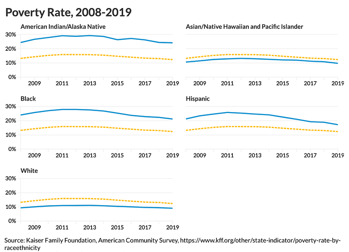
Although these more data-dense charts provide needed context, they can be more difficult to create and more difficult for readers to understand. One alternative to the single poverty rate line graph shown earlier that doesn’t add too much additional complexity is breaking the graph into multiple smaller graphs. Here, each graph contains the national average (as a dashed line), which enables a reader to compare against the overall, but separates the series to mitigate the “horse race” effect.

This small multiples approach may not be appropriate in all circumstances. Because a small multiples approach makes comparisons across groups more difficult, it’s worth understanding when those comparisons are the priority of a visualization. In the Do No Harm Guide: Applying Equity Awareness in Data Visualization report, Alice Feng and I argued that showing all racial and ethnic groups on the same chart might not be interpreted through a deficit-based lens if the visualization also presents sufficient context on the historical inequities and discrimination that led to the differences between groups. Because readers understand the gaps to be the result of historical discrimination, they may not necessarily view the chart as focusing on what those groups are lacking.
Presenting that sufficient context may be difficult, however, because of image size, platform limitations, or the creator’s expertise limitations. In the absence of technical limitations, content creators can add context by working with people and communities that are the focus of the research. The Urban Institute’s Community Engagement Resource Center, for example, has published a wealth of resources and research that directly incorporates these methods.
An easy way to think about when to use a single chart versus small multiples graph is to ask if the intended argument is specifically about disparities. Consider this graph of the suicide rate among young people across different racial groups (from the September 2022 Do No Harm Guide: Additional Perspectives on Data Equity report). In this example, the graph intends to show how much higher the suicide rate is for Native American youth (the pink line) — and its remarkable growth — relative to the other four groups. Because there’s such a large disparity, a reader is less inclined to make comparisons between groups, instead focus on the fact that the pink line is significantly higher than the other lines. If each line was put into its own small multiple, it would be harder to see that the suicide rate for Native American youth is two to four times as high as the other groups and the effect of the visual would be lessened.

Conclusion
There are advantages and disadvantages to placing different groups on the same graph within an equity framework. On the one hand, it can lead to a deficit-based perspective where readers might focus attention on what low-performing groups are lacking. On the other hand, sometimes the chart’s intent is to focus the readers’ attention on such disparities. In either case, data communicators need to understand and acknowledge the historical and institutional discrimination that’ve led to these gaps. Visualizing evidence of disparities can’t solve these pervasive and underlying challenges, but it’s worth exploring how data visualization and other methods can help our readers better understand structural racism and its historical context.
Taking an equitable approach to our data visualization efforts extends beyond just the language and colors we use. We must also consider how the visualizations we make can further inequities. Through our data and our visualization work, we can shed light on structural inequities and disparities across numerous domains. As you work with your data, consider when it’s worth visualizing all groups together using standard aggregate measures or if it’s worth using a different strategy that presents more data, shows more detail, or places groups on separate, distinct graphs.
