Bringing Data to Life: Physical Data Projects at Urban
Creating data visualizations can be a lonely business. You sit behind your desk working with code, design tools, or other programs to pull together a visualization you hope will elicit insight and help people make discoveries. But working at the computer all the time can also make us forget that people live in a physical world and that we can use that physical world to engage them in different and exciting ways.
Through data physicalization, we can map data to a physical form and facilitate tactile interaction, manipulation, and immersion. Think of the exhibits you’ve seen at a science museum or children’s museum, where there are different ways to interact by drawing, placing stickers on walls, touching screens, or flipping a panel. In the field of data visualization, we’ve seen a variety of data physicalization projects. In the Dear Data project, Giorgia Lupi and Stefanie Posavec mailed each other hand-drawn postcards from personally collected data over an entire year. The very cool Making with Data: Physical Design and Craft in a Data-Driven World by Samuel Huron, Till Nagel, Lora Oehlberg, and Wesley Willett (also check out my podcast interview with these folks) shows a variety of different physical data projects from a range of designers and artists.
I’ve always been intrigued by these physical expressions of data and wanted to bring a smaller-scale approach to work. About three months ago, I embarked on a project to engage my Urban Institute colleagues in a series of physical data visualization projects. With numerous conference rooms and common spaces less busy than they were before the pandemic — about a third of Urban staff are in the building on any given day — I discovered numerous open areas I could use to ask people to provide their own data and to explore the physical world of data.
Each week, I create a new Data Physicalization at Urban (what I call “DPAU”) project where I ask colleagues to answer a question using physical representations of their data. I set up the project in the morning, take pictures, and share the task and location (I try to move it to different areas each week) on two of our internal Slack channels. The project stays up for a week before it’s replaced with a new visualization. I post the results — sometimes with an actual digital recreation of the visualization using the collected data — to those same Slack channels.
Below, I share a short summary of the first 10 weeks of the DPAU project, which I hope to continue for as long as people continue to find it interesting and I keep coming up with ideas. If you’re interested in creating your own project at work, I’ve compiled this Amazon list of tools and materials you might need, and have published this post on my own PolicyViz website, where I will continue to update it with additional DPAU projects. And if you do create a project, consider sharing it with me and others.
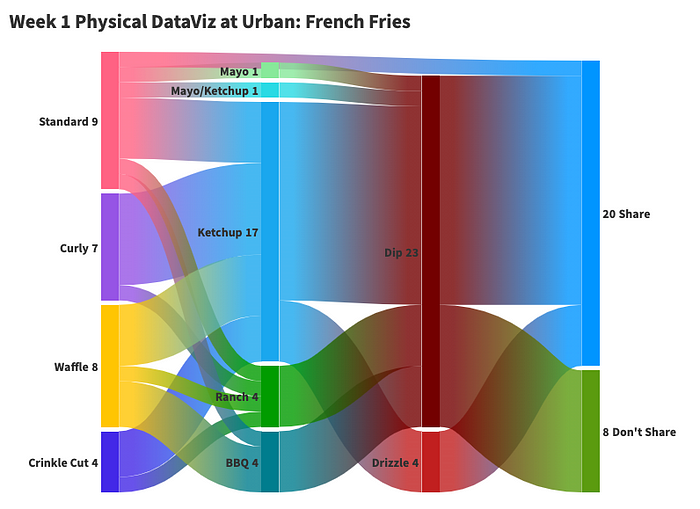
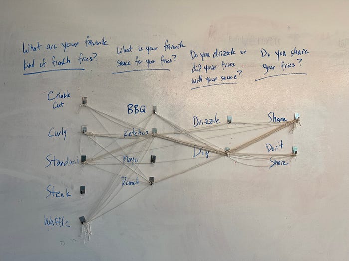
1. Sankey diagram of french fry consumption. For the first DPAU project, I wanted to create a Sankey diagram (or a parallel coordinates plot) to show preferences around french fry consumption. I attached hooks to a wall in four columns: favorite french fry (crinkle cut, curly, standard, steak, waffle), favorite sauce (BBQ, ketchup, mayo, ranch), whether you drizzle or dip your fries (dip, drizzle), and whether you share your fries (yes, no). Participants tied twine to connect each hook across the wall.
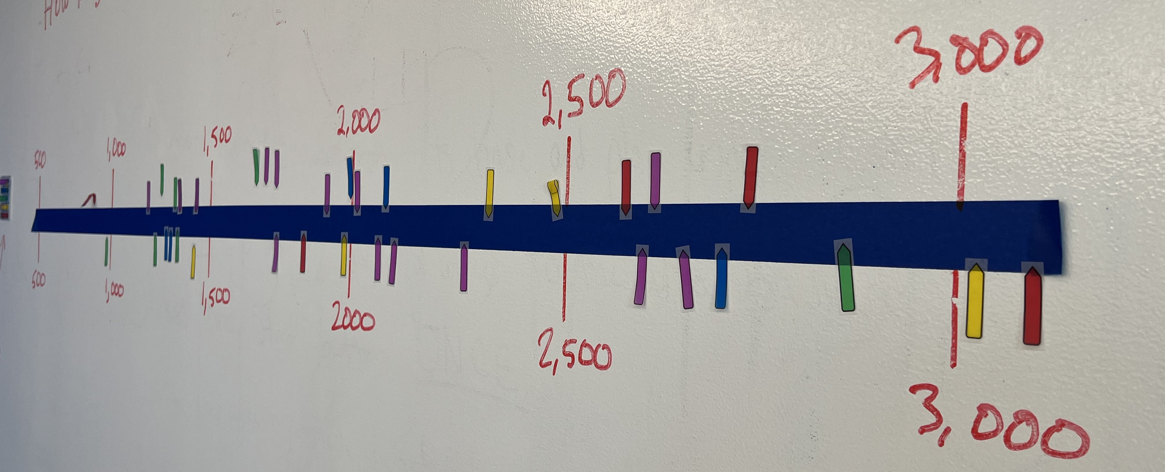
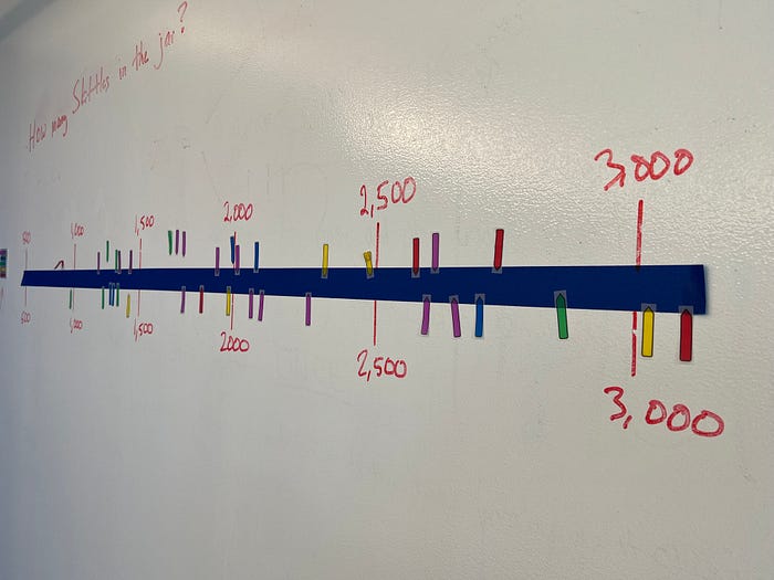
2. Skittles strip chart. I thought I could let people guess for how many Skittles were in a jar along a single horizontal line. Using little arrow Post-it notes along a line of painter’s tape, we created a strip chart of guesses. (After it was over, I opened the jar — the Skittles went quickly.)
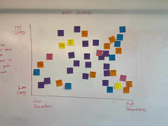
3. Mood meter scatterplot. I forgot to plan for the third week and needed to do something quickly, so a mood meter fit the bill. There are many ways to create mood meters, but one that creates an x-y space of pleasantness versus energy provides a place for participants to record their current feelings. I also incorporated the color of the Post-it notes to encode the number of days people come into the office, on average.
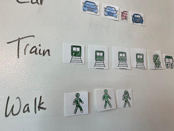
4. Isotype chart of commuting methods. Although not everyone is coming into the office, I wanted to know how those who do are getting to work. I created a set of icons for people to color in with their origin (DC, Maryland, Virginia, and other), which they could tape on the wall. I grabbed icons from the NounProject and inserted them into 8.5” x 11” PowerPoint slides, which I printed and cut. I stacked the icons, a bag of crayons, and a roll of tape next to the wall.
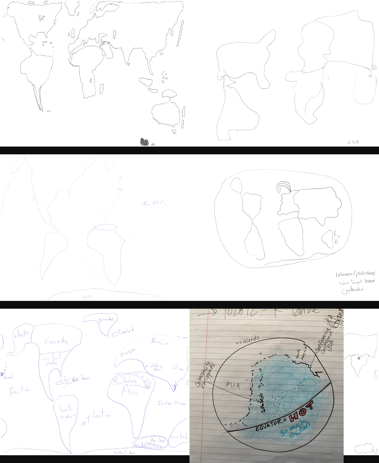
5. Draw a map of the world. I learned about this data visualization exercise from designer and illustrator Valentia D’Efilippo years ago and have used it in various workshops and training courses. It’s a simple exercise: draw a map of the world. The results are especially interesting in groups with people from around the world because they center their image of the world based on their personal experience. I didn’t want participants to be biased from previous entries, so I created a little gift-wrapped box for people to insert their drawings and later shared them as an animated gif.
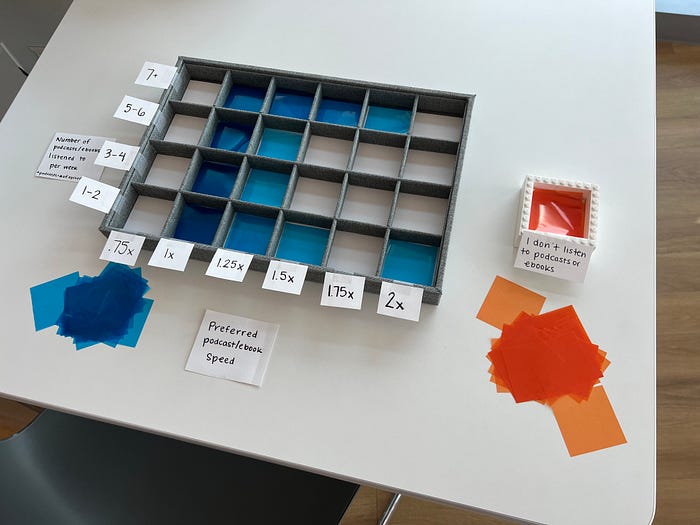
6. Heatmap of podcast listening. I was really excited about this one. I wanted to build a heatmap, but how could I use color and color saturation in a physical environment? The answer is cellophane paper — transparent paper that when layered, looks darker and darker. I bought and took apart a cheap jewelry box with 24 square boxes (six columns and four rows). Columns were labeled with podcast listening speeds (0.75x, 1x, 1.25x, 1.5x, 1.75x, and 2x), and rows were labeled with the number of podcast episodes listened to each week (1–2, 3–4, 5–6, 7+). I also added a separate box (built with Legos) for people who don’t listen to podcasts.
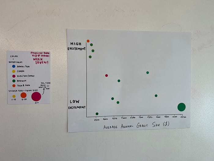
7. Bubble plot of project excitement. Thus far, the projects were about personal habits, preferences, and experiences. I hadn’t tried anything specific to our work, but this week’s project tried to look at just that. In building the bubbleplot, I asked people to put stickers of different sizes (team members) and color (research center) in an x-y space that showed average annual grant size (in dollars) and excitement for the project. Turns out there wasn’t much interest in this one — my guess is that most people don’t have a good sense of the total budget of the projects they work on — but the chart type is certainly one I’ll try again.
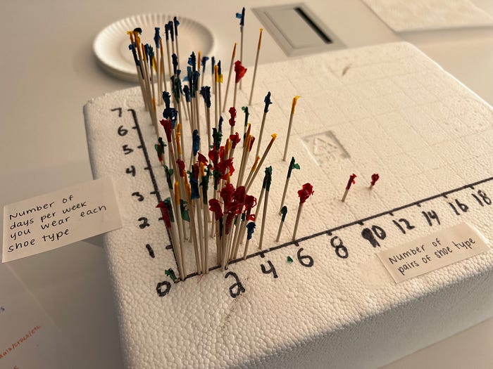
8. Shoe contour map. I don’t need or use 3D in my data visualizations and, frankly, I think it looks dated. But in the real world, 3D can be fun and can be used to encode multiple variables. I got back to the core spirit of the project this week, returning to people’s nonwork lives and experiences. So I focused on shoes. Having lunch with my son at a diner inspired this one — using cellophane-wrapped toothpicks and Styrofoam offered the opportunity to combine multiple variables in a single plot. Like the bubble plot, this project had four variables: the x-axis showed the number of pairs of shoes of different types, the y-axis showed the average price of those shoes, the foil color showed shoe type (sneakers, dress shoes, flip flops/sandals, boots), and the height showed the price. I definitely overestimated how many pairs of shoes people own, but I’ll likely try a similar visualization in the future.
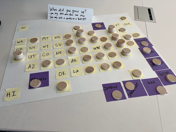
9. Tile grid map where you grew up. I may have missed the mark in the previous two weeks, so I decided to make this week’s project easier. I bought wooden disks (1” diameter) and laid out a tile grid map of US states on a big piece of poster board with Post-it notes (which I cut down from standard 3” x 3” Post-it notes to get the whole thing to fit). I also added full-size purple Post-it notes for countries outside the US. In my announcement, I noted that participants could include more than one disk if they grew up in different areas or states.
10. Chernoff faces. It’s a somewhat strange data visualization type, which is why there aren’t a lot of Chernoff face graphs out there. Basically, each part of the face — eyes, nose, mouth, hair, shape — becomes a variable. For this DPAU, I printed four shapes onto separate 3” x 5” index cards and provided stickers for people to create their own Chernoff faces consisting of four variables: favorite season (four seasons as the shape on the card); favorite book genre (six categories for the left eye); favorite movie genre (six categories for the right eye); favorite meal (three categories for the nose); and favorite music genre (seven categories for the mouth).

Some ask why I’ve taken on this project, with no request from a boss or manager or even funding to help purchase the supplies. There are four main reasons that, if you consider embarking upon your own data physicalization project, will likely resonate:
1. It’s creative. Every designer I know says anyone can draw. While I honestly feel like I’m the exception to that rule, I’m not publishing the results of this project somewhere (except for this blog post, obviously) or pulling them together in a formal report or database. I’m not worried about a peer review or data check. It’s not about data accuracy but about a data experience. It’s an opportunity to try something, to explore, to wander the aisles of a craft store and consider how a popsicle stick could be used to hold data.
2. It’s fun. Think about all the graphs and webpages you wish you could create or the data you wish you had in your day-to-day work. You can get it! You can create it! With some glue or markers or tape, you’ve got the beginnings of an exciting project.
3. It helps bring people together. I have seen people stand in front of these projects, talking about where they placed their marker or Post-it note or what they see in the data. These projects facilitate discussion and wonder.
4. Inform people about data visualization. Sankey diagrams, tile grid maps, and Chernoff faces are not the most common data visualizations, and I think it’s helpful to expose people to new and different ways to visualize their data. And you can highlight resources for people’s own work; when I started the tile grid map project, I shared a link to the internal tile grid map Excel template with researchers (you can download your own version from the Urban data visualization style guide.
In the foreword to Making with Data, Barbara Tversky summarizes why data physicalization works and what it helps us do.
Data begin as physical, real stuff in real space and in real time: people, things, places, events, ticks in time, a birth, a death, an atom smashed, a price declined, dots in space that accumulate. Data are collected, combined, reduced, transformed, and mapped, typically to space and typically to sight, but also to time, to sound, to touch, to smell to enable extracting the general from the individual, finding meaning, and drawing implications.
Data, then, are created by a process, a process that occurs in time and space. Seeing and, even better, grasping, manipulating, or creating physical instantiations puts you in touch, literally and figuratively, with the processes that transform aspects of the world into data. Directly experiencing physical instantiations slows you down, makes you pause, to think and reflect. What is this representing? What is the mapping from the world to the artifact? It can make you sense the process.
As you’ve seen here, these projects are fun, creative, and open a world of opportunity to connect with your colleagues. I hope you will consider your own experiments, and if you do, I hope you’ll share them with the wider world.
